Creating a sleek, dev-friendly brand and website for a GraphQL platform

Creating a sleek, dev-friendly brand and website for a GraphQL platform

OVERVIEW

OVERVIEW

Creating a visual language that appealed to both individual developers and large-scale GraphQL organizations.

Creating a visual language that appealed to both individual developers and large-scale GraphQL organizations.

The process of creating APIs has become more straightforward with time, but their utilization has become increasingly complex, with organizations integrating various products to achieve a functional system. Tailcall is developing a comprehensive solution that effectively addresses these challenges.

We were tasked with redesigning their website and revamping the existing logo. The goal was to showcase their services more effectively and improve engagement with prospective customers.

Client

Tailcall

Deliverables

Website Design

Visual Design

Logo Design

banner-image
banner-image

BRAND ANALYSIS

Analysing the existing logo

Inconsistent stroke-widths within the logo icon.

The tip of the arrow is notably sharp, which contrasts with the overall structure & the current logotype.

banner-image

Visual Identity

Brand colors

Brand colors

A dev-friendly color palette that incorporates neutral tones such as black, white, and shades of grey, complemented by a single accent color.

A dev-friendly color palette that incorporates neutral tones such as black, white, and shades of grey, complemented by a single accent color.

VISUAL IDENTITY

Typography

Typography

We considered utilizing typefaces with variable font options, streamlining font management by avoiding distinct font files for each weight. For terminal code display, selecting a mono font was ideal, ensuring clear legibility across the website.

A balance between Mono and Sans-serif fonts allowed us to connect with both traditional large-scale organizations and contemporary, tech-savvy developers.

We considered utilizing typefaces with variable font options, streamlining font management by avoiding distinct font files for each weight. For terminal code display, selecting a mono font was ideal, ensuring clear legibility across the website.

A balance between Mono and Sans-serif fonts allowed us to connect with both traditional large-scale organizations and contemporary, tech-savvy developers.

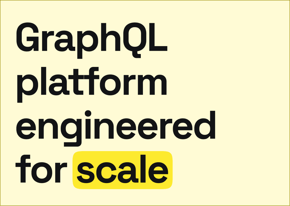
We used the color yellow strategically to draw attention to key elements, features, or keywords within our design.
Website Design

The Tailcall website’s visual language was designed to appeal to both individual developers and enterprise-level audiences, striking a balance between sophistication and accessibility. We opted for a clean, minimalistic white background approach, allowing our content and features to stand out.

banner-image
banner-image
banner-image
banner-image

CONTACT US

Over to you.

What's your big idea?

Let's bring it to life.

CONTACT US

Over to you.

What's your big idea?

Let's bring it to life.

CONTACT US

Over to you.

What's your big idea?

Let's bring it to life.